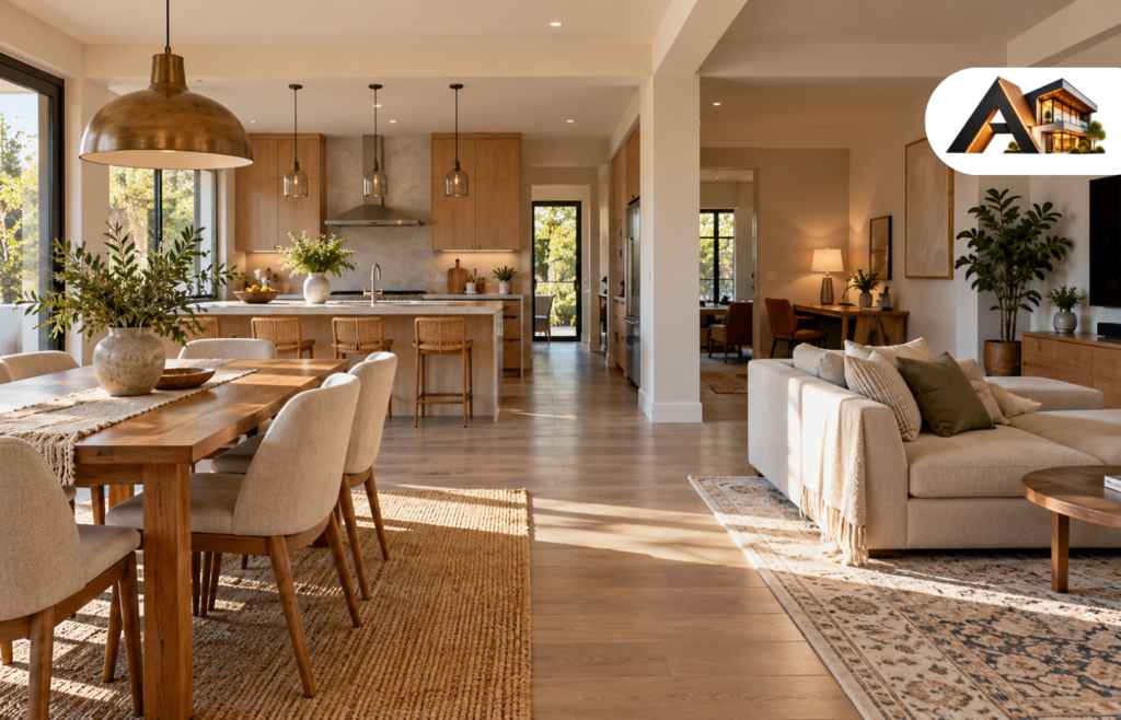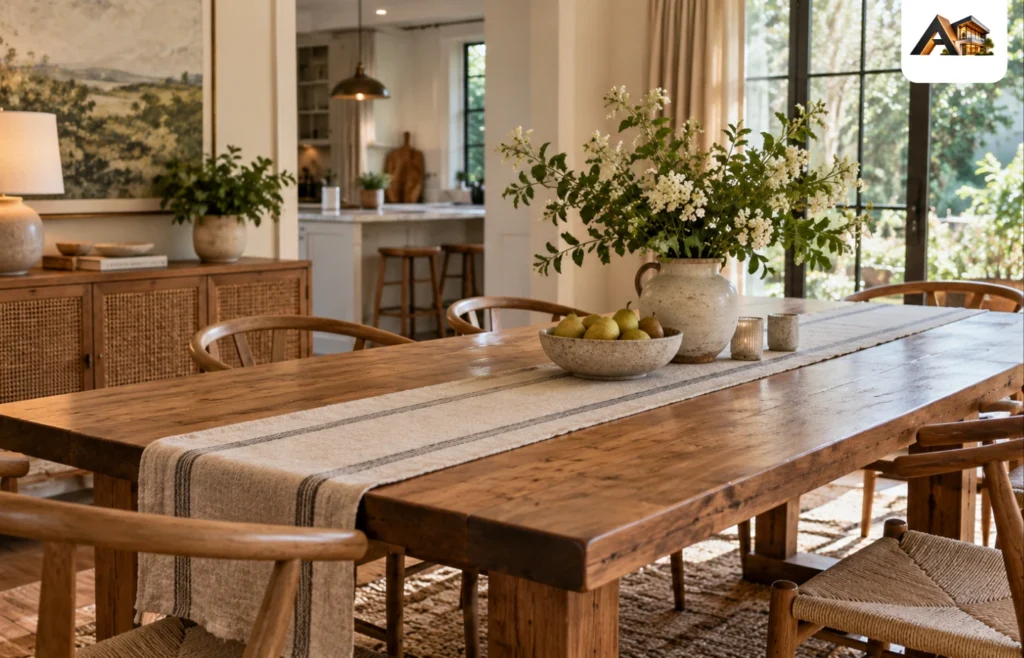
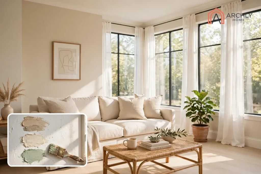
The living room paint colors that make a home feel bigger and brighter are light, warm-leaning neutrals with high light reflectance — shades like Agreeable Gray, White Dove and Pale Oak — u?sed on most of the walls, with deeper colors kept to a single accent wall or fireplace. Light walls bounce daylight around the room instead of absorbing it. The walls read farther away and the ceiling reads higher. That is the whole trick, and it works in a north-facing room with one small window just as well as it works in a bright open-plan space.
The 15 colors below cover the full range. Soft whites and greiges open a room up. Gentle greens and blues add color without closing the space in. Deep navies and charcoals anchor one wall while the rest of the room stays light. Every color names a real, widely sold paint shade. It says which direction of light it suits, and what to pair it with. You can pick from the list instead of guessing from a chip.
How To Choose A Living Room Paint Color That Makes The Room Feel Bigger?
Five decisions matter more than the shade name on the can. Get these right first, and almost any color on this list will work; skip them, and even the most popular shade can look wrong on your walls.
Start With The Light, Not The Color
Stand in the room at midday and note which way the windows face. North-facing rooms get cool, indirect light that flattens warm colors and turns cool colors grayer, so they need warmth. South-facing rooms get warm light most of the day, so most colors look their best there — but very warm colors can intensify and feel heavy. East-facing rooms are bright and warm in the morning and cooler later; west-facing rooms are cooler in the morning and golden in the late afternoon. A color that looks perfect in a south-facing showroom can look entirely different on your north wall.
Pick An Undertone Lane And Stay In It
Two paints that both look beige can behave very differently because their undertones differ — one leans yellow, one leans pink, one leans gray. Decide whether you want warm, cool or balanced undertones, then check that undertone against your fixed finishes: the floor, the sofa, the fireplace stone, the rug. If your floor is honey oak and your sofa is camel leather, a warm-leaning wall color will sit comfortably beside them; a cool gray with blue undertones will fight them all day.
Use Light Reflectance As A Guide, Not A Rule
Light Reflectance Value, or LRV, measures how much light a color bounces back. Higher numbers mean more bounce: pale colors sit high, deep colors sit low. For a room you want to feel bigger, lean toward lighter colors on the largest wall area and save deep colors for one feature. You do not need the exact LRV number to choose well — if a swatch looks bright and airy on the wall in daylight, it will do the job.
Follow The 60-30-10 Split
Roughly 60 percent of the room in your main wall color, 30 percent in a secondary color — large furniture, curtains, a rug — and 10 percent in accents like cushions and art. The split keeps a room feeling pulled together instead of busy, and it is the reason a deep navy accent wall works: the navy is the 10 percent, not the 60.
Sample Big, And Sample In Your Room
Paint a swatch at least 12 inches square on the actual wall — or on a large board you can move around — and live with it for two full days. Look at it in morning light, afternoon light and lamplight. Warm bulbs pull out yellow and beige undertones; cool daylight bulbs push colors grayer. The color that looks best across all those conditions is your winner. A store chip under fluorescent light tells you almost nothing.
Match The Sheen To The Surface
Eggshell or matte on living room walls gives a soft look and hides small imperfections; satin wipes clean more easily in a busy family room. Semi-gloss belongs on trim and doors, and flat on ceilings. A shinier finish reflects more light and can make the same color look slightly deeper, so test the sheen you plan to use, not just the color.
1. Agreeable Gray By Sherwin-Williams
Agreeable Gray, SW 7029, is the warm greige that shows up on more living room walls than any other single shade — a soft gray with beige undertones that reads beige in warm light and gray in cool light, and never reads cold. It is the safest starting point on this list, and the most forgiving. It suits wood floors, leather seating, linen upholstery and both warm and cool metal finishes without fighting any of them.
Best light: every direction, which is exactly why it sells so well. In a north-facing room its beige undertone warms up the cool light; in a south-facing room it stays calm instead of going yellow. If your living room opens into a kitchen or hallway, Agreeable Gray flows through the connected spaces without a visible seam, so the whole floor reads larger.
Pair it with: Pure White trim and ceilings, warm wood floors, cream or oatmeal upholstery, and one deep accent — a navy cushion, a charcoal throw, a black-framed print — so the room has somewhere for the eye to land.
Tip: if the room feels flat once it is up, the problem is usually not the color but the lack of contrast. Add a darker rug or a deep-colored sofa cushion before you decide the walls are wrong.

2. White Dove By Benjamin Moore
White Dove, OC-17, is the warm white designers reach for when a room needs to feel bright without feeling stark. It reads as white in most conditions, but it carries enough warmth that it never tips into cold or clinical — the difference between a room that feels freshly painted and a room that feels like a hospital corridor.
Best light: north-facing and dim rooms, where a cooler white would look gray and dingy. White Dove’s warmth balances the cool light, and because it reflects so much daylight, it makes a small or windowless-feeling room look noticeably larger. In a very bright south-facing room, test it first: too much direct sun can wash it out a little, and a slightly deeper warm white may hold up better.
Pair it with: natural wood tones, linen, warm brass and stone. It is the white that makes everything around it look better, so let the furniture and the art do the talking — a walnut coffee table, a textured cream rug, a linen sofa in oatmeal or sage.
Tip: compare White Dove against your trim before you commit. If your trim is a bright, cool white, White Dove walls can look creamy by comparison. Paint the trim the same White Dove, or pick a trim white with similar warmth, and the whole room will read as one calm surface.
3. Accessible Beige By Sherwin-Williams
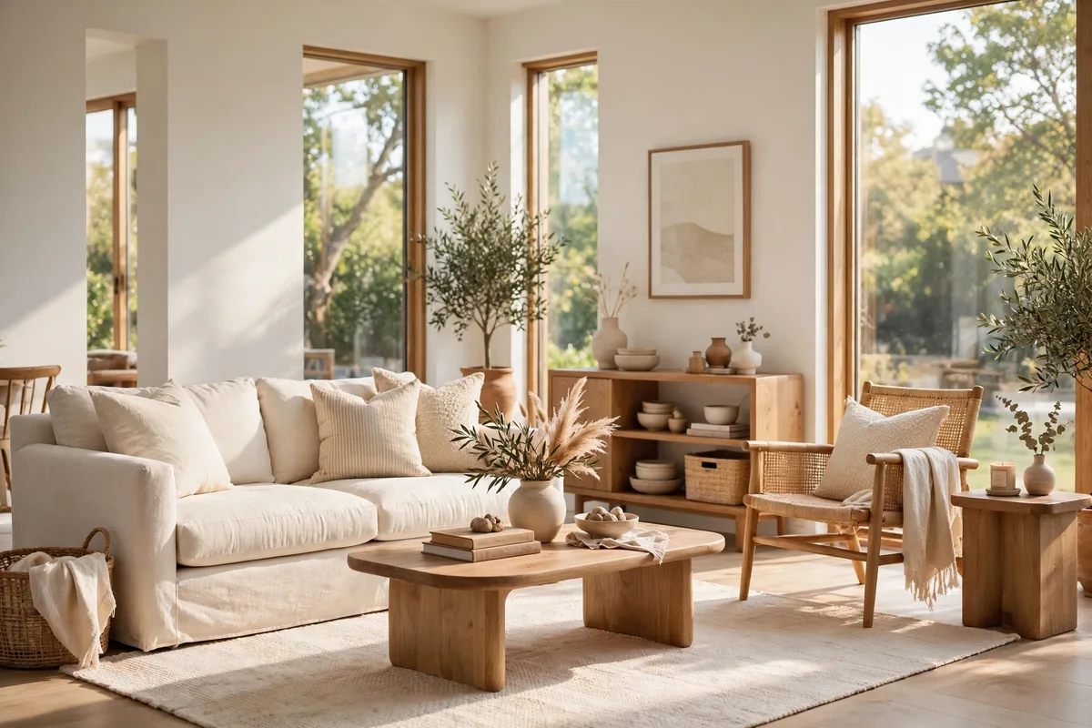
Accessible Beige, SW 7036, is a warm beige with a touch of gray — warm enough to feel inviting, cool enough to feel current, and versatile enough to work with almost any furniture color, wood tone or flooring. Designers call it one of the most reliable warm neutrals in the Sherwin-Williams range, and it earns that reputation in rooms where a plain beige would look dated and a plain gray would look cold.
Best light: bright rooms with warm wood floors, where you want the room to feel cozy rather than washed out. It holds its warmth in south and west light, and in a north-facing room it keeps the space from feeling chilly. It is a shade darker than Agreeable Gray, so it gives the walls a little more presence — useful in a large living room that feels empty in plain white.
Pair it with: medium wood tones, caramel leather, cream upholstery, black metal accents and warm brass. It sits beautifully under [crown molding](/what-is-crown-molding/) painted in a clean white, which frames the beige and keeps it from reading muddy.
Tip: Accessible Beige shifts with the light more than most neutrals, reading greener in some rooms and pinker in others. Sample it on two walls — one sunny, one shaded — and check it at night under your lamps before you buy the gallons.
4. Revere Pewter By Benjamin Moore
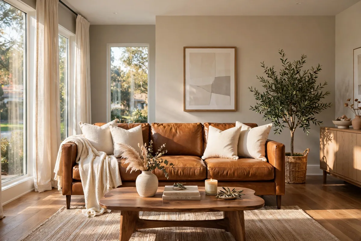
Revere Pewter, HC-172, is a classic warm greige with a slightly deeper, earthier tone than Agreeable Gray — the shade that has anchored traditional and transitional living rooms for over a decade. It has enough gray to feel sophisticated and enough warmth to feel lived-in, and it changes gracefully through the day: warmer in lamplight, grayer in daylight.
Best light: traditional or transitional rooms with mixed lighting, and rooms that get both warm and cool light at different times of day. It is a good pick for an east- or west-facing living room, where the light swings from warm to cool, because the color swings with it instead of clashing.
Pair it with: white trim, dark wood furniture, cream upholstery and warm metals. It looks particularly good with the kind of layered, collected look — a [cozy living room](/cozy-living-room-ideas/) with books, textiles and wood — because the walls stay quiet while the objects carry the color.
Tip: Revere Pewter is a step darker than the lightest greiges, so in a very small or very dark room, use it on three walls and keep the fourth — the one opposite the window — in a lighter warm white. You get the depth without losing the light.

5. Alabaster By Sherwin-Williams
Alabaster, SW 7008, is a soft, warm white that sits between white and cream — bright enough to open a room up, warm enough to feel comfortable at night. It is the white for people who find pure white too stark and cream too yellow, and it is one of the most forgiving whites for a living room that needs light.
Best light: north-facing rooms and rooms with limited daylight, where Alabaster’s warmth stops the walls from looking gray. It is also a strong choice for a living room with dark wood floors: the pale walls balance the dark floor and keep the room from feeling top-heavy. In a sun-drenched south-facing room, check it against your trim — very bright light can make it read a touch yellow next to a cool white.
Pair it with: light oak or pale wood, linen curtains, cream and oatmeal textiles, and warm brass or matte black hardware. Layer different shades of white through cushions, rugs and curtains to give the room depth instead of making every surface look identical.
Tip: Alabaster next to bright white trim can make the walls look yellow. If your trim is already a crisp white, sample Alabaster beside it in daylight; if the contrast bothers you, paint the trim Alabaster too, or choose a warmer trim white.
6. Shoji White By Sherwin-Williams
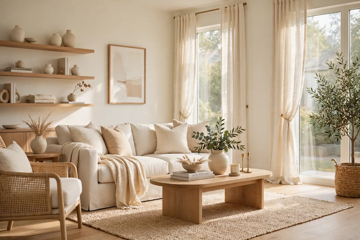
Shoji White is a warm, creamy off-white with undertones of gray, beige and sometimes a hint of green — think of a typical greige, only much lighter. It is one of the best choices on this list for a living room that needs more light without losing warmth, because it bounces daylight around like a white while keeping the soft, lived-in feeling of a neutral.
Best light: rooms that feel dark or flat, especially north-facing ones. Shoji White adds brightness without the starkness of a pure white, and its gray-beige undertone keeps it from going yellow in warm lamplight. It also suits open-plan living rooms, where one pale color needs to flow across a large area without looking blank.
Pair it with: pale oak, white oak floors, cream upholstery, natural linen and soft black accents. It works with both warm and cool furniture because its undertone sits in the middle — a gray sofa reads cool against it, a camel chair reads warm, and neither looks out of place.
Tip: Shoji White is subtle, so it needs texture to avoid looking plain. A woven rug, a linen sofa, a wood coffee table and a couple of plants give the walls something to work against. Without texture, a very pale room can feel unfinished rather than calm.

7. Dry Sage By Benjamin Moore
Dry Sage is a muted, dusty green that designers name as the standout living room color of the moment — and it earns the attention. Sage sits between gray and green, so it reads as a soft neutral with a pulse of nature in it, not as a bold color statement. It makes a room feel alive without making it feel loud, and it pairs with warm wood, cream and terracotta the way a neutral should.
Best light: rooms with plenty of daylight, where sage stays soft and fresh. In a darker room, choose a lighter sage and keep the trim bright white so the green does not go heavy. South-facing light warms sage up nicely; north-facing light keeps it cool and calm, which suits a quiet reading corner or a restful family room.
Pair it with: warm wood tones, cream upholstery, terracotta pots and cushions, rattan and woven textures, and houseplants — the green walls and real greenery reinforce each other. Brushed brass picture frames and warm wood side tables keep the palette from going cold.
Tip: sage is the color to try if you want color but you are nervous about color. Paint one wall first — the one behind the sofa — live with it for a week, and if you love it, carry it around the room. Most people do.
8. Secret Garden By Sherwin-Williams
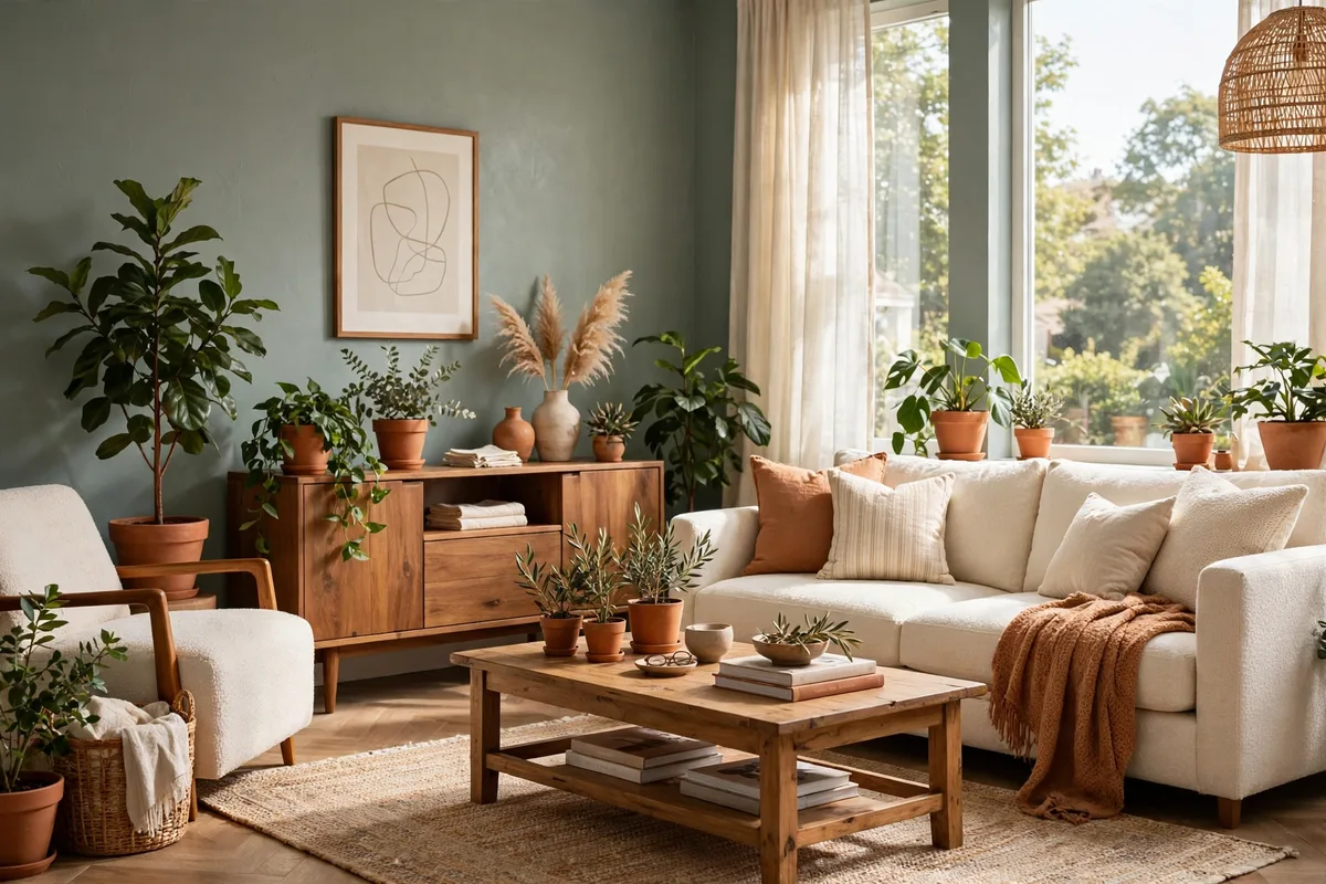
Secret Garden is a deeper, earthier green than Dry Sage — lush and natural, with enough depth to feel bold while still making a room feel at ease. It is the green for a living room that already has good light and wants atmosphere: a room for long evenings, books, conversation, and a fire going in winter.
Best light: bright rooms with large windows, where the green has daylight to play against. In a dim room, keep Secret Garden to a single accent wall — behind the fireplace or the sofa — and let pale walls do the rest. In a south-facing room it reads rich and warm; in a north-facing room it can go moody, which is beautiful if that is the mood you want, and too dark if it is not.
Pair it with: natural linen, cream upholstery, warm brass, natural leather and pale oak. The contrast between the deep green wall and cream fabric is what makes the room work — without something pale in the room, a deep green can swallow the light.
Tip: a deep green shows wall imperfections more than a pale color does. Fill, sand and prime carefully before you paint, and use two thin, even coats rather than one heavy one. The smooth finish is what makes the color look expensive.
9. Hale Navy By Benjamin Moore
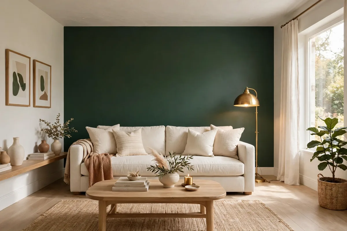
Hale Navy, HC-154, is the definitive classic navy for interior walls: deep without being black, warm without being cold, timeless without being boring. A living room painted in Hale Navy feels anchored and confident, and it is the color designers reach for when a room needs one strong, deliberate statement.
Best light: rooms with good natural light and white trim, where the navy has something bright to push against. Use it on one wall — the fireplace wall, the wall behind the sofa, or a wall of built-ins — and keep the other three walls pale. In a small room with little light, a full navy room can feel closed in; as an accent, it adds depth and makes the pale walls look brighter by contrast.
Pair it with: white trim, natural linen, cream or oatmeal upholstery, warm brass and pale wood. Navy and brass is one of the most reliable combinations in interior design, and it works just as well with a linen sofa and a jute rug as it does with leather and dark wood.
Tip: deep navy needs a tinted primer underneath, or an extra coat over a light base — otherwise the coverage goes patchy and the color looks uneven. Budget for the primer and the extra coat before you start, and cut the edges in carefully: dark paint shows every wobble where it meets a light wall.
10. Naval By Sherwin-Williams
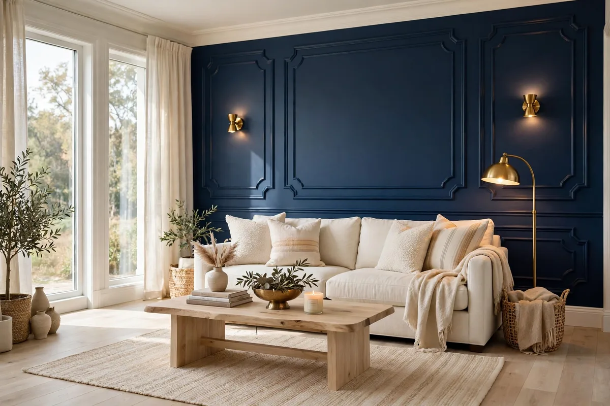
Naval, SW 6244, is Sherwin-Williams’ deep, rich navy — a shade darker and more saturated than Hale Navy, with a confident, designer feel. It is the accent color to choose when you want the fireplace or the sofa wall to be the room’s focal point, and it works because navy reads sophisticated and calm rather than loud.
Best light: a solid, uninterrupted wall in a room with decent light. Avoid putting Naval on a wall broken up by several doors or windows, since the contrast chops the wall into pieces. A chimney breast, a plain wall behind the main sofa, or a built-in bookcase wall lets the color read rich and deliberate. If your living room is part of an [open-plan design](/ideas-for-designing-a-living-room/), keep Naval in the living zone only, so the color marks the room’s boundary without a wall doing it.
Pair it with: Agreeable Gray or White Dove on the other walls, Pure White trim, cream upholstery and warm wood. The classic three-color set — greige walls, white trim, Naval accent — is a complete palette, and it needs very little else: a brass lamp, a cream rug, a wood coffee table.
Tip: paint the greige walls first, let them dry fully, then tape the corner and cut in the Naval. Pull the tape while the final coat is still slightly wet for a crisp, clean line. Deep colors show touch-up marks, so keep a small pot of the same batch for later fixes.
11. Potter’s Clay By Benjamin Moore
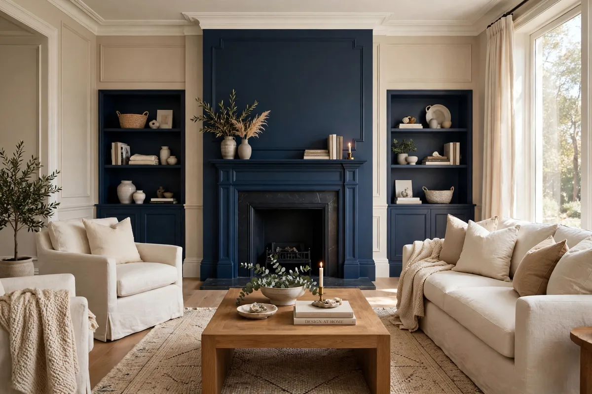
Potter’s Clay is a warm, earthy terracotta that captures the Southwestern and Mediterranean mood driving so much of current design — confident without being overwhelming, and warm in a way that photographs beautifully. It is the color for a living room that wants personality and sun, even on a gray day.
Best light: south- and west-facing rooms, where warm light deepens the clay tone instead of fighting it. In a north-facing room, use it on one accent wall rather than all four, so the warmth reads as a glow instead of a weight. A dusty, muted terracotta works better than an intense orange across a whole room — the muted version stays sophisticated, the bright version tires quickly.
Pair it with: natural linen, cream or oatmeal upholstery, warm wood, rattan, handmade pottery and olive-green accents. Terracotta and olive green are a natural pair, and a cream sofa keeps the room from feeling too hot. Dark wooden furniture grounds it; ivory curtains soften it.
Tip: terracotta changes a lot between daylight and lamplight — it can look peachy in the morning and brick-red at night. Sample it on the wall you will see most in the evening, and check it under the bulbs you actually use before you commit.
12. Carmelized By Sherwin-Williams
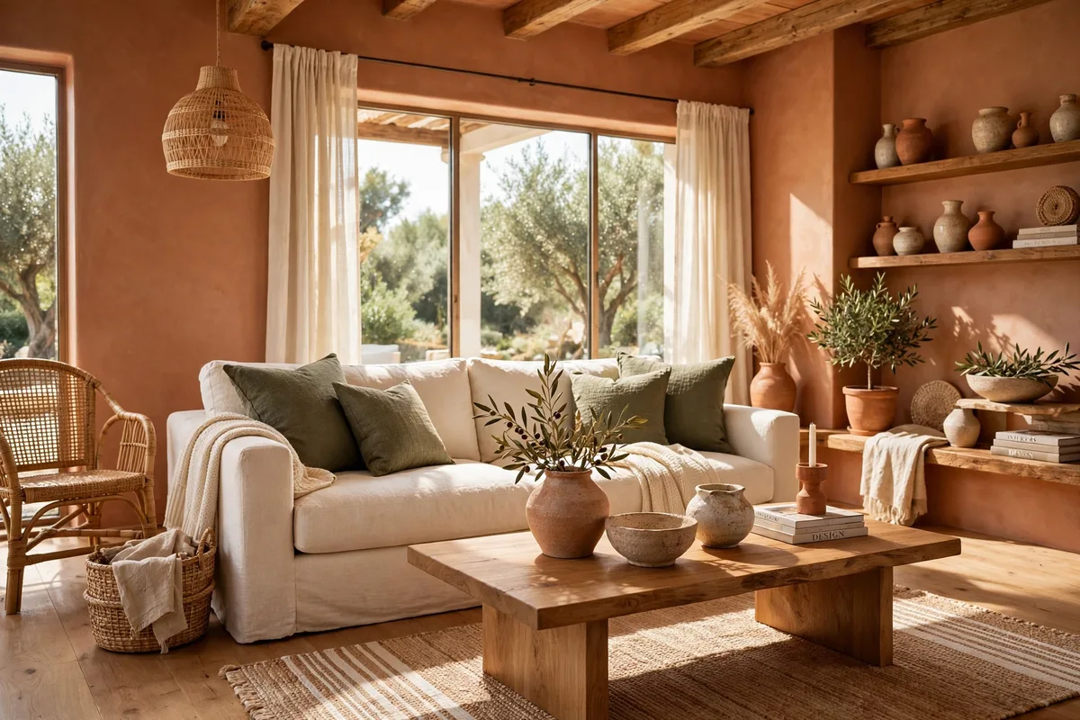
Carmelized is a warm, honey-amber shade that creates a sense of golden light regardless of the actual light in the room — a room painted in Carmelized feels like late afternoon, all day. It is bold but welcoming, specific but versatile, and it is the color to choose when a living room feels flat and needs warmth more than it needs brightness.
Best light: rooms that run cool or dim, where the honey tone does the work the sun is not doing. In a north-facing room it is transformative; in a very bright south-facing room it can intensify, so test a large swatch in the afternoon sun before you paint the whole room. It suits a living room with dark wood floors especially well, because the warm walls and warm floor reinforce each other instead of competing.
Pair it with: cream upholstery, natural linen, dark wood, warm brass and deep green accents. The green — a sage cushion, a plant, an olive throw — stops the honey tone from going too sweet. Keep the ceiling and trim a clean warm white so the amber has a frame.
Tip: honey-amber is a commitment, so try it first on the wall behind the sofa or the fireplace. If it feels right as an accent, it will feel right all over; if it feels too strong as an accent, it will overwhelm the room.

13. Sea Salt By Sherwin-Williams
Sea Salt, SW 6204, is a pale blue-green with a soft, coastal calm — light enough to behave like a neutral, colorful enough to give a room a personality. It is the shade designers name when a living room needs to feel fresh and open without going plain white, and it is one of the best colors on this list for making a small room feel bigger.
Best light: rooms with good daylight, where the pale blue-green reads airy and bright. It also suits north-facing rooms surprisingly well: its gentle warmth keeps it from going cold, and the cool side of the color balances the gray light. In a very sunny room it can look almost white at midday and greener in the evening, which is part of its charm — the walls change with the day.
Pair it with: white or pale wood furniture, sandy beige fabrics, natural woven textures, white ceramics and soft gray upholstery. It is a natural fit for a coastal or relaxed living room, but it works just as well in a modern room with clean lines — the color is quiet enough to sit behind almost any furniture.
Tip: Sea Salt is subtle, so it needs contrast to register. A darker rug, a walnut side table or a deep green plant gives the pale walls something to sit against. Without one darker element, the room can look washed out in photographs and in person.
14. Pale Oak By Benjamin Moore
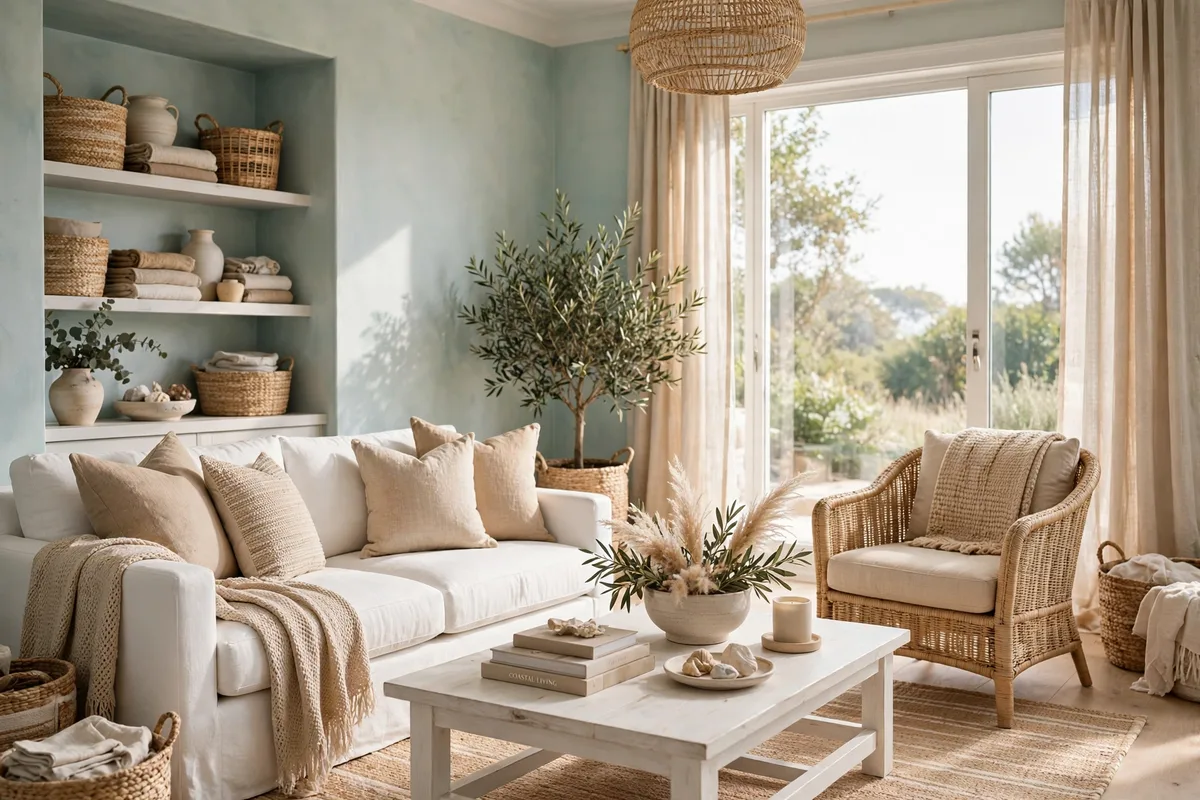
Pale Oak is a light, warm greige — a whisper of beige and gray that reads as an off-white with depth. It is the color for a living room that wants the brightness of white with a little more character, and it is one of the most forgiving pale colors for rooms where pure white feels too stark and beige feels too yellow.
Best light: south-facing rooms with plenty of natural light, where Pale Oak’s warmth keeps it from looking cold and its lightness keeps the room feeling expansive. In a north-facing room it stays soft and warm, though it can read slightly grayer there — sample it on the darkest wall before you decide. It is a strong choice for a [small living room](/small-living-room-ideas-for-apartments/) because it reflects light well while still giving the walls a finished, intentional look.
Pair it with: warm wood floors, cream and oatmeal textiles, soft gray upholstery and warm metals. Pale Oak sits comfortably with both warm and cool furniture, which makes it a good choice when your sofa is gray and your floor is warm oak — the wall color bridges the two instead of picking a side.
Tip: because Pale Oak is so light, it shows roller marks and patchy coverage more than a mid-tone color does. Use a good primer, keep a wet edge while you roll, and do two full coats. The smooth, even finish is what makes a pale color look premium instead of thin.
15. Chantilly Lace By Benjamin Moore
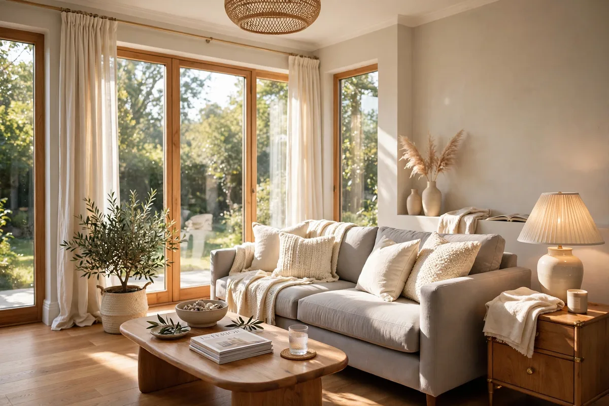
Chantilly Lace, OC-65, is a crisp, clean white with a subtle cool undertone — the white for a living room where you want the architecture, the art and the layered textures to shine while the walls disappear. It delivers a fresh, modern white without feeling stark or sterile, and it is the brightest color on this list.
Best light: bright, modern rooms with plenty of daylight and strong architecture — high ceilings, large windows, white trim, black accents. In a dim north-facing room, Chantilly Lace can look cold, so it suits rooms that already get good light. Pair it with warm furniture and warm lighting to keep it welcoming; on its own in a dark room, a cool white can feel unfinished.
Pair it with: warm wood, natural linen, black metal, warm brass and one strong color accent — a deep green sofa, a navy cushion, a terracotta pot. The white walls are a gallery wall for everything else in the room, so the furniture and art carry the warmth while the paint carries the light.
Tip: a crisp white shows every undertone in the room, including the undertones of your floor and your trim. Sample Chantilly Lace beside your flooring and beside your trim in daylight; if the floor looks pink or the trim looks yellow next to it, the white is telling you the truth about those finishes, and you may want a warmer white instead.
Light Colors Vs Deep Colors At A Glance
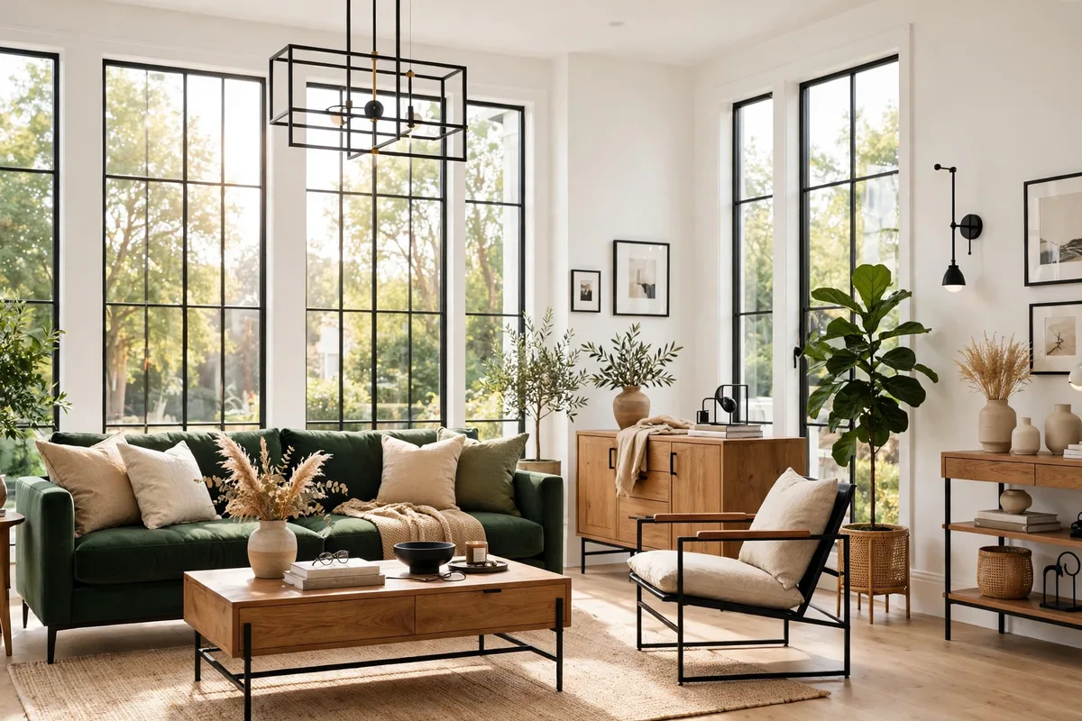
The choice between a pale wall and a deep wall is really a choice about what the room should do. Pale colors open a room up; deep colors anchor it. Most living rooms want both — pale on most walls, deep on one.
| Approach | What It Does | Best For | Watch Out For |
|---|---|---|---|
| Pale walls all over | Reflects light, walls read farther away, room feels bigger | Small rooms, north-facing rooms, low ceilings | Can look flat without texture and contrast |
| Deep color on one accent wall | Adds depth and a focal point, makes pale walls look brighter | Fireplace walls, sofa walls, rooms with good light | Too many dark walls close the room in |
| Color drenching (walls, trim and ceiling in one deep color) | Creates a cocooning, enveloping room | Large rooms with high ceilings and strong light | Needs excellent lighting; risky in small or dim rooms |
| Tonal layers (same color family, lighter and darker) | Feels calm and intentional, adds depth without contrast | Open-plan rooms, rooms with mixed furniture | Keep the undertones matched or it looks muddy |
If you are torn between a pale color and a deep one, the accent wall is the compromise that almost always works: paint three walls pale, paint the fireplace or sofa wall deep, and live with it for a month. You can always paint the accent wall pale later; repainting a whole dark room is a much bigger job.
How To Test Paint Before You Commit?
Testing is the step most people rush, and it is the step that saves the most regret. Buy sample pots of your top two or three choices — or peel-and-stick samples — and paint large swatches, at least 12 inches square, directly on the wall in the actual room. Live with them for at least 48 hours, looking at them in morning light, afternoon light, evening light with the lamps on, and at night. The color that looks best across all those conditions is your winner, and it is rarely the one that looked best on the chip.
Compare the samples against your fixed finishes, not against each other in isolation: hold them next to the flooring, the sofa fabric, the fireplace stone and the rug. A color that looks perfect on a white card can look wrong next to a red-toned wood floor. And change your bulbs before you sample if you plan to change them at all — warm white bulbs around 2700K pull out yellow undertones, while cool daylight bulbs above 5000K push colors grayer. For a second opinion on how light reflectance works in real rooms, The Spruce’s guide to paint colors that make rooms feel lighter and brighter walks through the same off-whites, beiges and pale blue-greens with designers’ notes on where each one works.
Frequently Asked Questions
What Is The Best Paint Color For A Living Room?
There is no single best color — the right one depends on your light, your furniture and the mood you want. Warm neutrals such as greige, creamy white and mushroom beige are the most versatile starting points because they work with many furniture styles. If your room is dark or north-facing, start with a warm white like White Dove or Alabaster; if it is bright and large, a deeper color like Hale Navy on one wall adds the character a pale room can lack.
What Color Makes A Small Living Room Look Bigger?
Light colors with high light reflectance make a room feel bigger: soft whites, pale greige, light sage and pale blue-green bounce daylight around instead of absorbing it. Paint the walls, trim and ceiling in closely related light tones so the edges of the room blur, keep the floor visible with a rug that does not cover all of it, and put the deepest color on one accent wall at most. A single dark accent wall adds depth; four dark walls close the room in.
Should The Living Room And Dining Room Be The Same Color?
In an open-plan space, yes — or very closely related tones from the same color family. Different colors in connected spaces create visual choppiness that makes both rooms feel smaller. Use the same color throughout, or a slightly lighter or darker version of it, to create a cohesive flow. In a closed room with a door between the spaces, you have the separation to use a bolder color on one side.
What Paint Finish Should I Use In A Living Room?
Eggshell or satin on the walls: both have just enough sheen to be wipeable and durable while still looking soft. Flat paint hides wall imperfections best but shows marks in a busy family room. Semi-gloss belongs on trim and doors, and flat on the ceiling. Deep colors show touch-up marks and burnishing more easily than light colors, so matte gives a deep navy its richest look while eggshell adds durability on a fireplace wall.
How Do I Know If A Paint Color Will Work In My Room?
Test it on the actual wall in your actual room. Buy a sample pot, paint a large swatch at least 12 inches square, and observe it over 48 hours in different light conditions — morning, afternoon, evening lamplight and night. The store chip and the wall will look completely different, and the only test that matters is the one done in your light, against your floor and your furniture.
A living room paint color earns its place when it does two jobs at once: it makes the room feel bigger and brighter, and it makes the furniture you already own look better. Start with the light your room actually gets, pick an undertone lane that suits your floor and sofa, sample big, and let one deep accent do the talking while the pale walls do the lifting. Fifteen colors is a long list — but you only need one, and the right one is the one that still looks good at 9 o’clock at night under your own lamps.