A kitchen earns its keep on an ordinary Tuesday night, not on the day it photographs well. The test is simple: can you unload groceries, chop vegetables, stir a pot, and set the table without crossing your own path three times or hunting for the peeler? Most kitchens that feel frustrating fail on movement and storage long before they fail on style. The good news is that the fixes are mostly decisions, not square footage. Get the layout right, give everything a sensible home, light the work surfaces properly, and the room starts working with you instead of against you.
This guide walks through the whole picture — layouts, work zones, storage, surfaces, islands, lighting, seating, color, and small-space fixes — so you can borrow the ideas that fit your room and skip the ones that don’t.
Start With How You Actually Cook
Before choosing a single cabinet or countertop, pay attention to your own routine for a week. Notice where you naturally set down grocery bags, which drawer you reach for first, and where clutter collects. That clutter tells the truth about your kitchen: it gathers exactly where storage is missing or awkward.
A household that cooks one big meal a day needs a different setup than one built around quick breakfasts and takeout containers. Families with kids need a spot for school bags and snacks that isn’t the prep counter. Someone who bakes needs a stretch of clear counter and a place for a mixer that doesn’t require lifting it out of a low cabinet every time. A coffee drinker needs a station near the water source, not a machine parked across the room from the mugs.
Write down the three tasks you repeat most, then plan around them. Everything else in the room is supporting cast. When a kitchen idea doesn’t serve one of those core tasks, it’s decoration, and decoration should come last, not first.
Choose A Layout That Fits The Room
Layout is the single biggest lever you have. A beautiful finish on a bad layout still feels bad every day, while a modest finish on a good layout feels easy to live with. The classic layouts below cover nearly every home, and each suits a different room shape.
The Five Layouts Worth Knowing
The one-wall layout puts everything along a single wall. It suits studios and open-plan apartments, and it works best when tall cabinets and a slim refrigerator keep the run compact. Its weakness is distance: the sink, stove, and fridge can end up far apart, so plan the order carefully, with the sink between the fridge and the cooktop when possible.
The galley layout runs two parallel counters with a walkway between them. It is one of the most efficient shapes for a single cook because everything sits within a step or two. It needs a clear aisle, though — a walkway squeezed below about three feet turns every meal into a shuffle, and opposing appliance doors can collide.
The L-shaped layout uses two adjoining walls and leaves the rest of the room open. It adapts well to kitchens that open into a living or dining area, and it gives you a natural corner to solve with a pull-out or carousel unit rather than a dead cabinet. It also leaves room for a small table or a peninsula later.
The U-shaped layout wraps three walls and delivers the most counter and storage space of any standard shape. It suits a dedicated kitchen room rather than an open plan, since the third wall closes the space off. In a U-shape, keep the middle aisle generous or the room can feel boxed in.
The island layout adds a freestanding block to an L-shape or one-wall kitchen, creating extra prep space, storage, and seating. It only earns its place when there is enough clearance on all sides — an island that chokes the walkways around it costs more in daily frustration than it gives back in counter space.
| Layout | Best For | Watch Out For |
|---|---|---|
| One-Wall | Studios and open-plan apartments | Long distances between sink, stove, and fridge |
| Galley | Narrow rooms and single cooks | Tight aisles and clashing appliance doors |
| L-Shaped | Kitchens opening to living areas | Wasted corner cabinets |
| U-Shaped | Dedicated kitchen rooms | A closed-in feeling if aisles are narrow |
| Island | Larger rooms that need prep space and seating | Walkways squeezed by an oversized island |
Keep The Work Triangle Sensible, Not Sacred
The old work triangle rule connects the sink, cooktop, and refrigerator, and the National Kitchen and Bath Association’s planning guidelines suggest keeping each leg between 4 and 9 feet, with the total under 26 feet, and no major traffic path cutting through the middle. Those numbers are a useful sanity check, not a law. If your triangle measures a little long because the fridge sits near the dining area for good reason, that trade may be worth it. What matters is the principle behind the numbers: short, unobstructed paths between the three places you visit most, with no one walking through your cooking zone to reach another room. For a deeper look at the planning standards behind these clearances, the NKBA’s own kitchen planning material is a solid reference: NKBA kitchen planning guidelines.
Think In Zones, Not Just A Triangle
Modern kitchens work better when planned as zones, each one holding everything its task needs. The prep zone sits near the sink with knives, boards, and bowls within arm’s reach. The cooking zone gathers pots, pans, spatulas, and oils beside the stove. The cleanup zone pairs the sink with the dishwasher, trash, and recycling. A storage zone holds dry goods and pantry staples, ideally close to where groceries get unloaded.
Zoning pays off in a small but real way: it stops the daily treasure hunt. When the baking tray lives three cabinets away from the oven, you waste a minute every time you roast vegetables. When spices sit above the cooktop instead of across the room, seasoning dinner becomes one motion instead of a trip. Two cooks benefit even more, since each person can work in a different zone without stepping into the other’s path.
A landing spot beside each major appliance matters just as much. The fridge needs a counter nearby for setting down bags. The oven needs a heat-safe surface for a hot tray. The microwave needs a place for the dish coming out of it. If any appliance opens onto empty air or a doorway, that missing landing spot will announce itself daily.
Storage That Keeps Counters Clear
Clear counters are less about discipline and more about storage that fits what you own. Deep drawers beat low cabinets for pots and pans, because you can see everything from above instead of crouching to reach the back of a dark box. Dividers inside those drawers keep lids from sliding into a jumble, and a vertical divider for baking sheets and cutting boards turns a narrow cabinet into genuinely useful space.
Tall cabinets earn their keep for pantry goods, brooms, and appliances that only come out occasionally. A pull-out larder in a slim gap — even a narrow one — can hold a surprising amount of bottles and jars while keeping labels visible. Corner cabinets, the classic dead zone, improve dramatically with a pull-out carousel or a blind-corner unit that brings the contents to you.
Open shelving deserves a careful decision rather than a reflex. A few open shelves for everyday plates and glasses can make a kitchen feel lighter and put daily items within easy reach. A whole wall of them, though, becomes a display you have to dust and curate. A practical middle ground is open shelving in one spot — near the coffee station or above a prep area — with closed cabinets everywhere else.
Small habits multiply the effect of good storage. Group items by task rather than by type, so the breakfast things live together and the baking things live together. Store heavy items low, everyday items between waist and eye level, and rarely used items high. And give the countertop appliances a rule: if something hasn’t been used in a month, it belongs in a cabinet, not on the counter.
Surfaces That Can Take Daily Use
Countertops take more abuse than any other surface in the house — hot pans, knife slips, spilled coffee, and homework projects. Quartz has become popular for good reason: it resists stains, needs no sealing, and comes in a wide range of looks, including convincing stone patterns. Granite offers natural variation and strong heat tolerance, but it needs periodic sealing and every slab looks different, which is a feature or a drawback depending on your taste. Butcher block brings warmth and can be sanded back to new after scratches, though it asks for regular oiling and is less forgiving of standing water. Laminate has improved far beyond its old reputation and remains the most budget-friendly route to a fresh look, with the trade-off that it can’t be repaired as easily once damaged.
The honest way to choose is by your own habits. If red wine and turmeric appear often, stain resistance matters more than a dramatic veining pattern. If you set hot trays straight down without thinking, heat tolerance should lead the decision. If you love a patina that changes with use, a living material like wood or marble may suit you better than a surface designed to look identical in ten years.
The backsplash is the surface that ties the whole wall together, and it takes the splashes the countertop escapes. Modern backsplash materials and layouts can change the feel of a kitchen without touching a single cabinet — our guide to modern kitchen backsplash ideas walks through options that hold up to daily cooking and still look current. Whatever material you choose, run it all the way to the underside of the upper cabinets or to a clean stopping point, and seal the joint where it meets the counter so steam and spills have nowhere to hide.

The Island Question
An island is the most requested kitchen feature and the most commonly oversized one. Before falling for a big block, check the clearances around it: you need comfortable walking room on every side, and seating needs knee space plus room behind the stools for someone to pass. A peninsula — an island attached to a wall or a run of cabinets at one end — often delivers most of the benefit in a smaller room, since it needs clearance on three sides instead of four.
What the island holds matters as much as its size. An island with a prep sink turns it into a genuine second work zone. One with deep drawers becomes the home for pots and baking trays. One with only a slab of counter and a row of stools is mostly a table, and a table is cheaper. Storage inside the island should face the working side, while seating faces outward, so cooks and sitters don’t compete for the same edge.
Sizing is where most island plans go wrong, and it is worth getting specific before committing. Our guide to kitchen island sizes covers the clearances and dimensions that keep an island comfortable rather than cramped. As a rule of thumb, if the island leaves you sidestepping around it with a tray in your hands, it is too big for the room — shrink it, or switch to a peninsula or a movable cart that can leave when you need floor space.
Lighting In Three Layers
Kitchens lit by a single ceiling fixture tend to have one bright spot and a ring of shadows exactly where you chop. Three layers fix that. Ambient lighting provides general brightness — ceiling fixtures, recessed lights, or a flush mount spread across the room. Task lighting puts light directly on the work: LED strips under upper cabinets are the single most effective upgrade in most kitchens, because they light the counter without casting your own shadow over it. Accent lighting adds warmth and focus: pendants over an island, a small light inside a glass-front cabinet, or a picture light over open shelving.
Color temperature matters as much as brightness. A warm white (around 2700K to 3000K) keeps a kitchen feeling welcoming in the evening, while a cooler white suits a room that needs to feel crisp and bright. Mixing wildly different temperatures across fixtures makes the room feel unsettled, so pick one temperature family and stick with it. Put task lights on their own switch or dimmer so you can light the counters for cooking and soften the room for dinner without rewiring anything.
Natural light deserves a plan of its own. If you have a window over the sink, keep the treatment simple so daylight reaches the work surface. If the kitchen is short on windows, a lighter backsplash and pale upper cabinets bounce what light exists further into the room. Under-cabinet lights also do quiet work in windowless corners, turning a dark stretch of counter into usable prep space.
Seating That People Actually Use
Kitchen seating fails most often on comfort, not looks. A stool that looks perfect in a photo but leaves legs dangling or knees jammed against the counter will sit empty while everyone stands. Counter-height seating (around 24 to 26 inches for a standard 36-inch counter) suits most islands and peninsulas, while bar-height stools suit a raised 42-inch counter. Either way, each seated person needs elbow room — roughly two feet of width — and knee space beneath the overhang, not a cabinet door pressing against their shins.
Backs matter more than people expect. Backless stools tuck away neatly and suit a quick coffee, but anyone settling in for a meal or homework will prefer a low back for support. If space is tight, a bench along one side of a peninsula seats more people in less room and slides fully underneath when not in use.
Think about who sits there and when. A breakfast spot for two needs less than a homework-and-dinner hub for a family. Seating that faces the cook keeps conversation flowing, while seating that faces a wall or a blank cabinet invites people to drift to another room. Place the seats on the side away from the main work path, so diners aren’t sitting in the route between the fridge and the stove.
Color And Material Choices That Hold Together
A kitchen holds together when one or two materials lead and the rest support them. Pick a dominant element — often the cabinets or the countertop — and let the backsplash, hardware, and flooring echo it rather than compete with it. Two-tone cabinets work when the split has a reason: darker lowers that ground the room and lighter uppers that keep it airy, or a contrasting island that marks it as the social center.
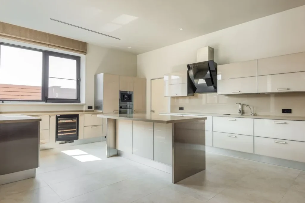
Warm and cool tones need a referee. If your countertop leans cool gray, warm brass hardware and wood stools can bridge the gap, but pairing a cool gray counter with warm beige tile and stainless steel without any connecting tone leaves the room feeling undecided. Pull one color through in small doses — a wood cutting board, a matching shelf, a rug in a related shade — and the palette starts to read as intentional.
Flooring deserves the same thinking. A kitchen floor must survive water, dropped pans, and constant traffic, and it should relate to the floors around it, especially in an open plan. A sharp break between kitchen tile and living-room wood can work if it marks a real boundary, but a floor that flows through with a rug or runner softening the kitchen zone usually feels calmer.
Small-Kitchen Fixes That Punch Above Their Size
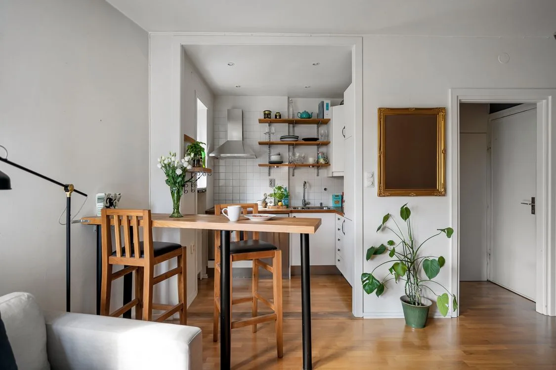
Small kitchens reward a different kind of thinking. Instead of adding more, the goal is making what exists work harder and look lighter.
- Replace a wall of heavy upper cabinets on one side with open shelves or a single run of glass-front cabinets, so the room breathes without losing everyday storage.
- Run cabinets all the way to the ceiling and keep a small step stool nearby, so the top shelf holds seasonal items instead of dust.
- Choose a slim dishwasher, a compact refrigerator, or a combination microwave-oven where a full-size appliance eats space you need for counters.
- Use the inside of cabinet doors for measuring cups, spices, or cleaning supplies, and add a rail on a free wall for utensils and frequently used pans.
- Pick one continuous countertop material and a simple backsplash so the eye travels without stopping at every seam and pattern change.
- Add a rolling cart or a fold-down table for extra prep space that can disappear when the cooking is done.
Light color helps, but it isn’t the whole story. A small kitchen painted entirely white with no texture can feel flat; a pale cabinet paired with a wood accent, a patterned tile, or a warm metal handle gives the eye something to land on. Reflective touches — glass cabinet fronts, a glossy backsplash, a mirror near a window — bounce light around without adding a single square foot.
A Sensible Order For Making Changes
Big kitchen projects go wrong when finishes get chosen before the plan is settled. A steadier order looks like this: first, fix the layout and the clearances, including any wall changes and appliance positions. Second, settle storage — drawer layouts, pantry space, and corner solutions — because storage decides how much cabinetry you actually need. Third, choose surfaces and lighting together, since countertop color affects how light behaves in the room. Fourth, pick hardware, seating, and decorative details last, when the room’s real colors are already in front of you.
For a refresh rather than a remodel, the same order still works at a smaller scale. Start with decluttering and storage fixes, since those cost little and change daily life immediately. Then lighting, especially under-cabinet strips. Then the backsplash or hardware, which change the look without touching plumbing or wiring. Paint and new seating come last, once the functional pieces are right.
Frequently Asked Questions
Should I Move Plumbing And Gas Lines To Get A Better Layout?
Sometimes, but weigh it carefully. Moving a sink or a stove can unlock a genuinely better layout, and it is often worth it when the current placement forces a bad work triangle or blocks a walkway. Moving plumbing and gas lines adds cost and complexity, though, and it can introduce new problems if the new run is long or awkward. A useful test: if the layout works well except for one appliance sitting a few feet from where it should be, get a professional quote for the move before deciding — and if the current layout only annoys you mildly, spend the money on storage and lighting instead.
Can I Mix Metals And Finishes In One Kitchen?
Yes, and most well-designed kitchens do. The trick is to mix with intent rather than by accident. A common approach is one dominant metal for the hardworking fixtures — faucets, cabinet pulls, appliance handles — and a second metal used sparingly as an accent, such as pendant lights or a pot rail. Keep the two metals in a similar finish family, for example both brushed rather than one polished and one matte, and repeat each metal at least twice so it reads as a choice rather than a leftover.
Is Open Shelving Practical For A Busy Family Kitchen?
It can be, in moderation. Open shelves work best for the items you reach for every day — plates, bowls, glasses — because constant use keeps them from gathering dust. They struggle as the only storage in a busy kitchen, where the sheer volume of items turns display into clutter. The practical version is a short run of open shelving near the prep area or coffee station, with closed cabinets handling the rest. If you like the look but worry about upkeep, glass-front cabinets give a similar lightness with far less dusting.
A kitchen that cooks well and looks good isn’t the product of one dramatic choice. It comes from a layout that respects your routine, storage that puts things where your hands expect them, light that reaches the work, and surfaces chosen for your real habits. Pick the ideas here that solve a problem you actually have, and leave the rest for another room. The best kitchen isn’t the one with the most features — it’s the one that makes an ordinary meal feel easy.